AREX POS Systems
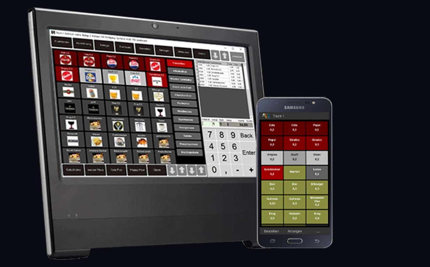
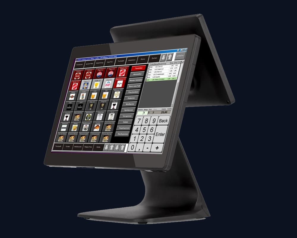
Development of an intuitive touchscreen POS interface, mobile handheld ordering systems, and brand identity for modern hospitality point-of-sale hardware.

The Challenge
Point-of-sale systems in hospitality and retail demand split-second speed and total reliability during peak hours. Waitstaff and cashiers must book items, manage table splits, and process payments without friction. Existing solutions were cluttered, unintuitive, and required steep learning curves. Furthermore, upcoming fiscal regulations (KassenSichV / TSE) required a modern, tamper-proof architectural foundation.
The Solution
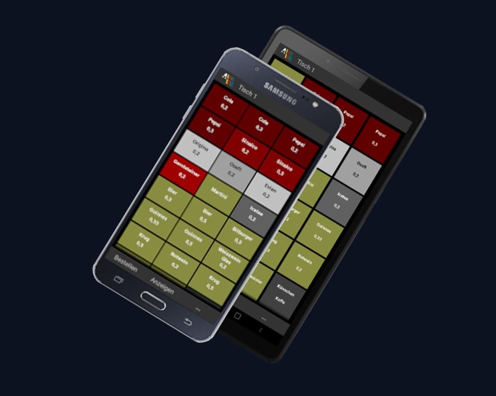
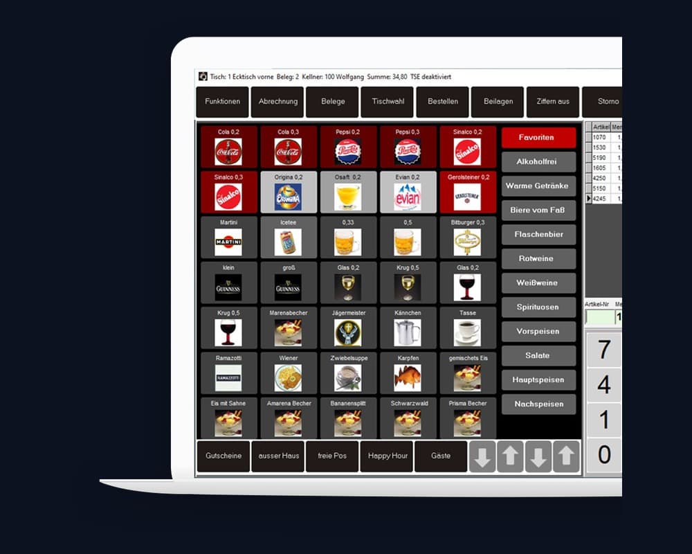
Conception and design of a highly ergonomic touch interface system: large, color-coded rapid-access buttons for categories and bestsellers, a clearly separated order and checkout display, and synchronized mobile handheld interfaces for tableside ordering. Complemented by a crisp brand identity with the tagline 'Das zahlt sich aus', hardware visualizations, and certification badges for German cloud hosting and regulatory compliance.
The Result
Training time for new staff reduced from days to under 15 minutes, 30% faster order processing during peak hours, and successful market positioning of AREX as a trusted full-service provider for modern POS infrastructure.